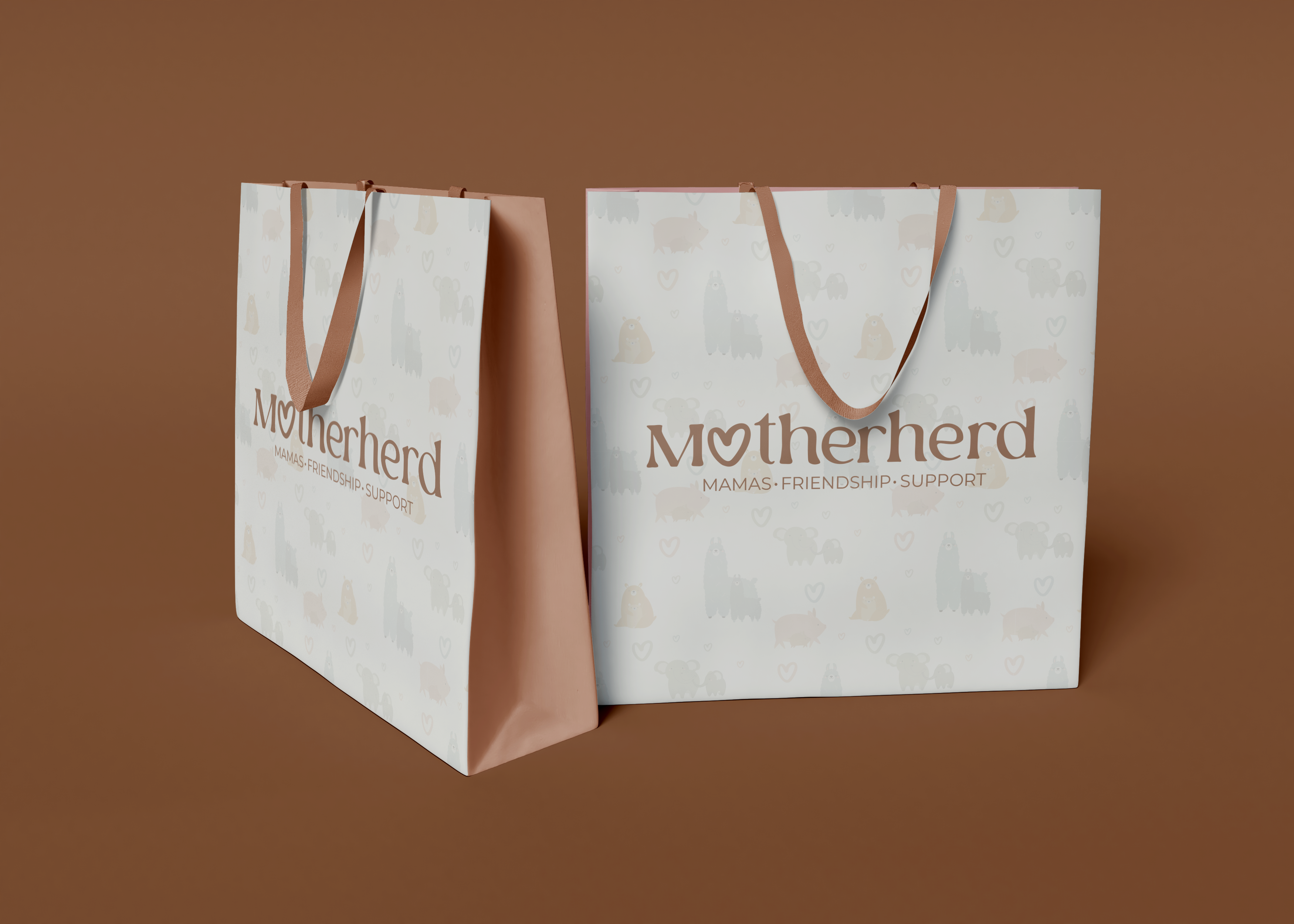
 Packaging — tote bag
Full brand identity concept for a community platform built around mamas — covering logo system, custom brand pattern, packaging, and event collateral across every touchpoint.
Packaging — tote bag
Motherherd is a brand concept for a community platform built around mamas — a space rooted in friendship and mutual support. The brief centred on creating an identity that felt warm and approachable without being childish, and distinctive enough to carry across physical events and branded collateral.
The tagline — Mamas. Friendship. Support. — became the strategic foundation. Every brand decision was made to reflect that: the soft typographic logo, the playful animal pattern, the warm terracotta palette, and collateral designed for real community moments.
The strategy was to build a brand that feels less like a network and more like a lifeline. Motherhood can be isolating, so the visual language needed to immediately dismantle formality and signal a space of zero judgment. The tone combines the warmth of a close friend with the organisational utility required to host real-world events and manage a digital community.
The heart-O at the centre of the logotype is the signature mark — a simple, clever device that communicates community and love without feeling forced. The wordmark sits in a rounded serif that feels warm and approachable, paired with the spaced uppercase tagline to give it structure. The logo works across both the warm cream background and dark applications.
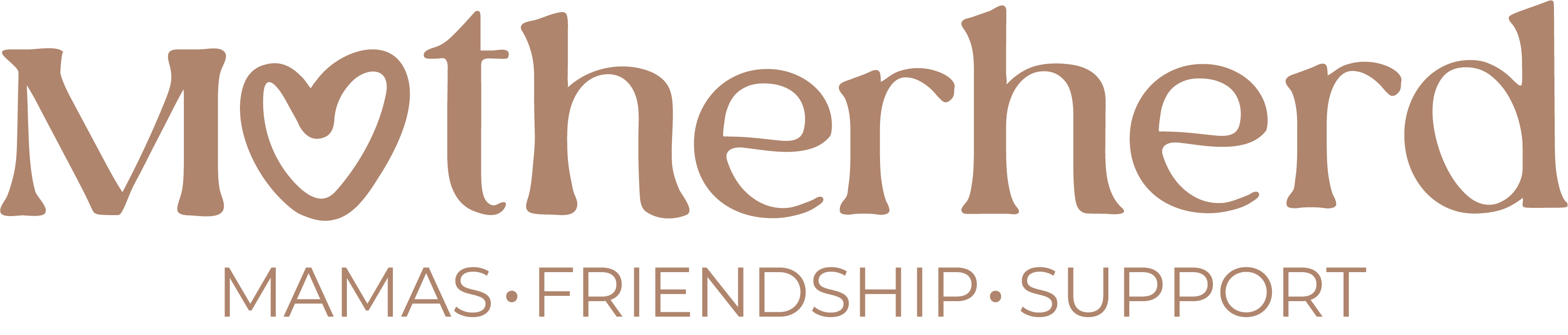 Primary Logo
The custom illustrated pattern features a cast of animals — llamas, pigs, bears, and cows — scattered with hearts across a repeating tile. It was developed in two colourways: a soft light version for packaging surfaces and print, and a dark version for digital and high-contrast applications. The pattern is the brand's most distinctive asset — it communicates playfulness and warmth at a glance.
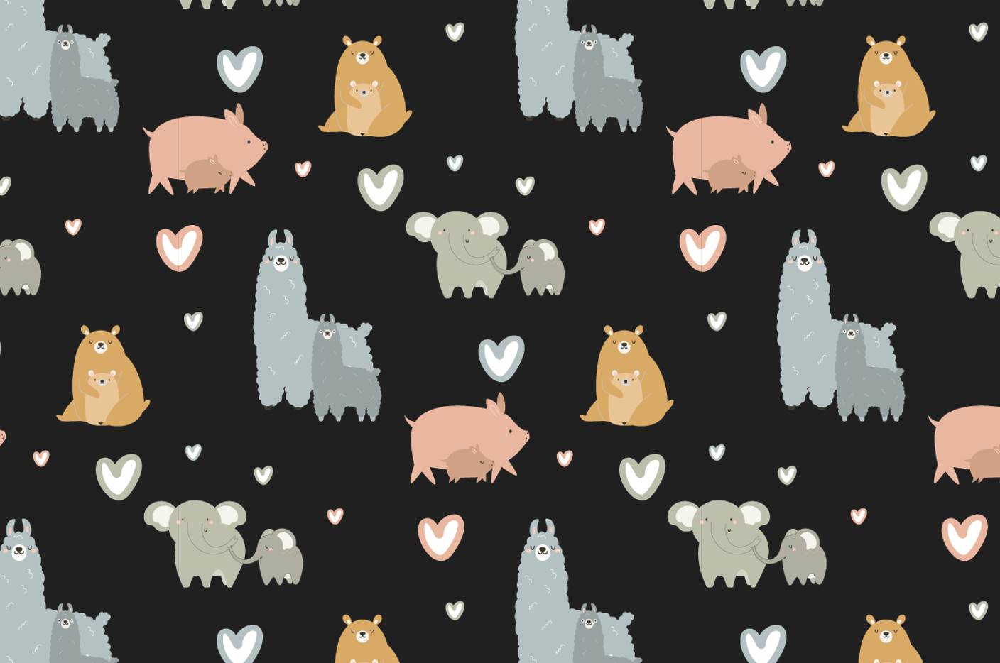 Dark colourway
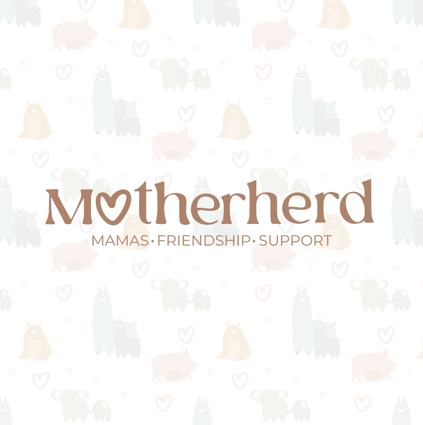 Light colourway
The tote bag brings the brand pattern to life as a physical product — cream base with the light animal pattern wrapping all faces, logo centred front and back, terracotta ribbon handles. It's the kind of packaging that gets kept. Designed to be given at events and to members as a community welcome.
Events are where community brands live or die. The collateral suite covers every physical touchpoint — from arrival (wristbands) to the memory that follows (ticket stub). Each piece carries the brand consistently: terracotta palette, rounded logotype, warm cream and brand brown.
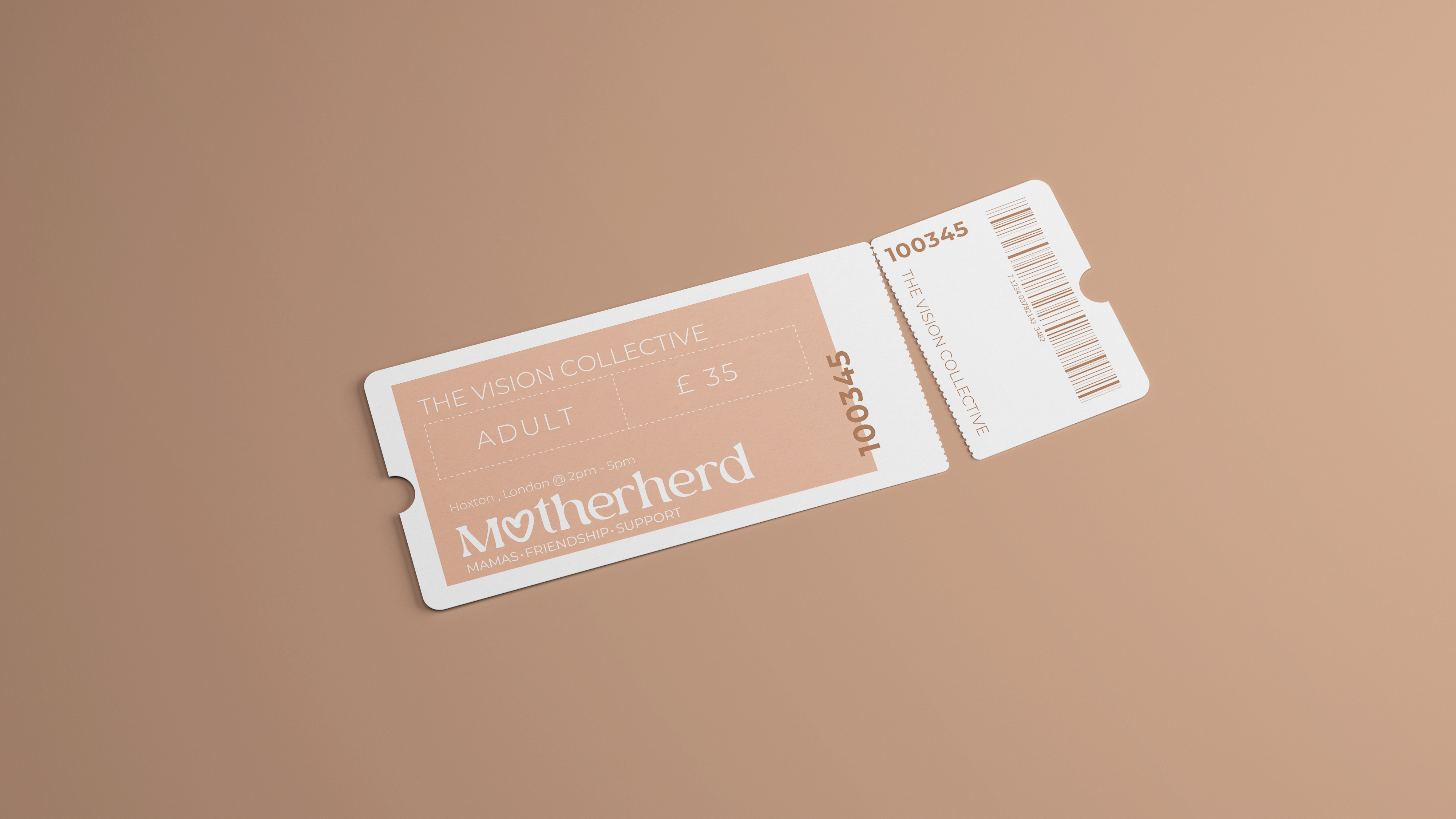
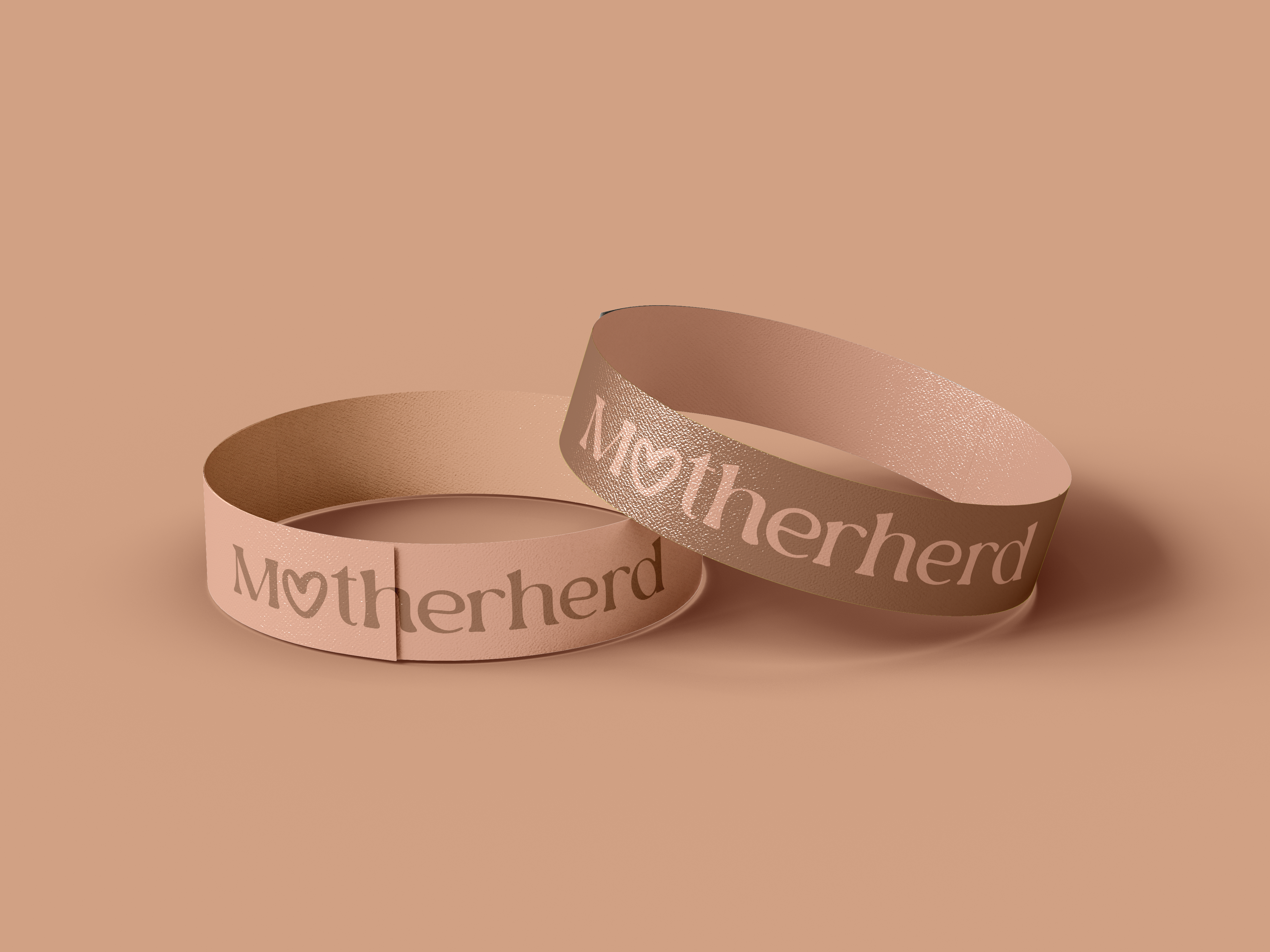
Across six deliverables, Motherherd demonstrates what a brand identity looks like when it's taken all the way — from the logo to the packaging to the moment someone puts on a wristband at an event.
About this project — Motherherd is a self-initiated concept project developed to explore community brand identity and event collateral design. It demonstrates the full scope of identity work Studio Kaiso can deliver, from logo through to physical touchpoints.