 Website — Homepage
A full brand built from scratch for a neurodivergent community platform — strategy, identity, illustrated character system, and website. Every element conceived, designed, and built in-house.
Website — Homepage
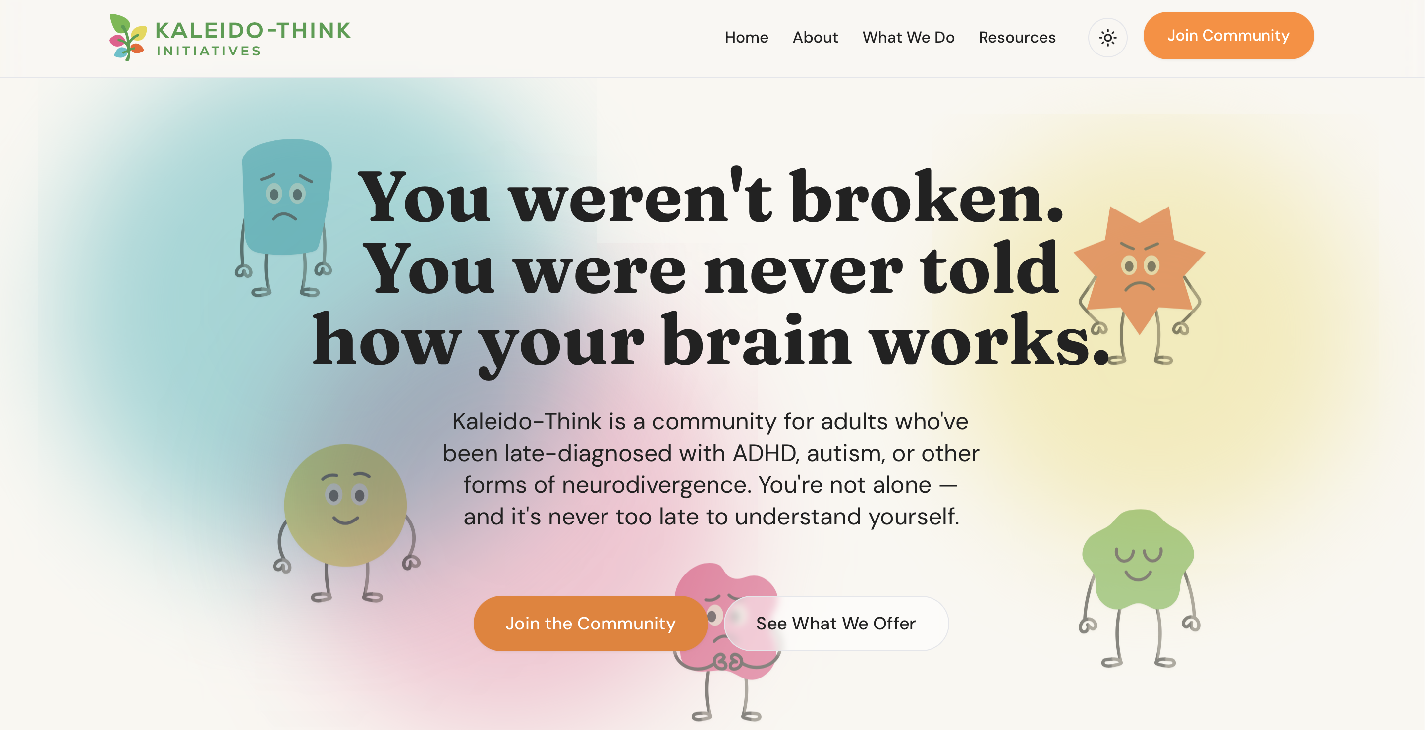
KaleidoThink is a community platform for adults who've been late-diagnosed with ADHD, autism, or other forms of neurodivergence — people who spent years being told they were difficult, lazy, or broken, without anyone explaining why their brain works differently.
The brand had to do something specific: feel immediately safe and welcoming for people who've often been let down by institutions, while also being distinctive and credible enough to attract workplace training clients and sector partners. Warm but not soft. Playful but not patronising.
As co-founder, the full creative direction — strategy, naming, identity, character design, and website — was built entirely in-house at Studio Kaiso.
The core strategic challenge was servicing two drastically different audiences with the same brand: vulnerable individuals seeking community, and corporate HR directors acquiring workplace training. Lean too heavily into a clinical framework, and it alienates the community. Lean too far into casual playfulness, and it loses B2B corporate credibility.
We architected a 'structured warmth' strategy. This meant building a visual and verbal identity that uses rigorous, clean typography and accessible high-contrast design to satisfy neurodivergent sensory needs, while relying on custom illustration and conversational copy to deliver the empathy required by the community.
The KaleidoThink wordmark references the kaleidoscope — a fitting device for a brand built around neurodivergence, where every brain sees the world through a different lens. The identity needed to feel organic and warm without losing credibility. The multi-coloured pinwheel mark gives the brand an immediately recognisable icon that works independently across social, merchandise, and digital.
 Horizontal — light
 Stacked — dark
 Icon mark
 Icon variant
The character system is the most distinctive creative asset in the brand. Five original illustrated characters — each representing a different emotional experience familiar to neurodivergent people — were designed and illustrated from scratch. They give the brand warmth, personality, and an immediate point of recognition that no stock illustration or generic icon set could achieve. They appear across the website, social content, and community materials.
 Sunny
The optimistic one — good days feel great
Sunny
The optimistic one — good days feel great
 Rainy
The low-energy one — some days are harder
Rainy
The low-energy one — some days are harder
 Sparky
The energised one — hyperfocus activated
Sparky
The energised one — hyperfocus activated
 Worry
The anxious one — overthinking everything
Worry
The anxious one — overthinking everything
 Zenny
The calm one — grounded and at peace
Zenny
The calm one — grounded and at peace
Every character was designed and illustrated in-house — no templates, no stock assets. The brief was to create characters that neurodivergent people would actually see themselves in, not polished mascots that feel corporate or detached.
The website serves two distinct audiences simultaneously: community members looking for belonging and understanding, and organisations looking to bring neurodivergent workplace training in-house. The design uses the character system throughout, with an open, airy layout and clear calls to action. The headline — "You weren't broken. You were never told how your brain works." — sets the tone immediately.
Fully designed and built from the ground up, including community platform integration, resource sections, and a workplace training pathway.
KaleidoThink demonstrates the full range of what Studio Kaiso can deliver — from the strategic thinking that shapes a brand's positioning, to the illustration work that gives it a personality no one else has, to the website that brings it all to life. Built as a co-founder, not a hired hand.
About this project — KaleidoThink is a co-founded venture, not client work. It is included in the Studio Kaiso portfolio because every element of the brand — strategy, identity, illustration, and website — was conceived and executed by Studio Kaiso. It demonstrates the full depth of capability applied to a real, live product.