 Brand collateral overview
A brand concept for a literary reading café — navy, gold, and blush; a custom typeface; and a full print and packaging suite designed to feel like stepping into a favourite book.
Brand collateral overview
House of Chapters is a concept for a reading café — a space where books, coffee, and community sit together. The brief was to build a brand that earns its place in that world: something that feels considered, literary, and genuinely beautiful, not a generic hospitality identity with a bookshelf in the background.
The direction landed on navy, gold, and blush — a palette that references the materiality of old books, gilded spines, and pressed botanicals. Elegant without being cold. Warm without being casual. The custom typeface was designed specifically for the brand, giving the identity a letterform no one else has.
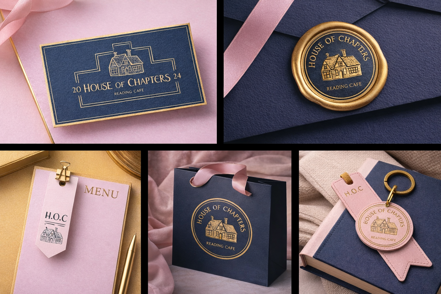
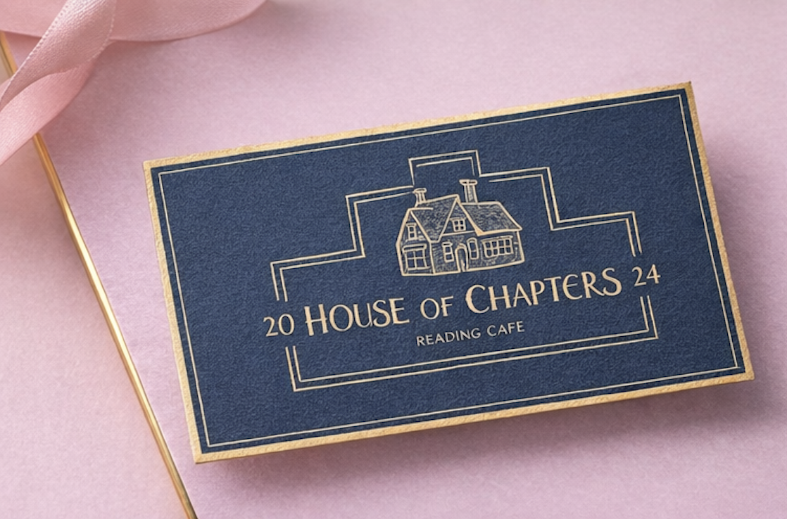
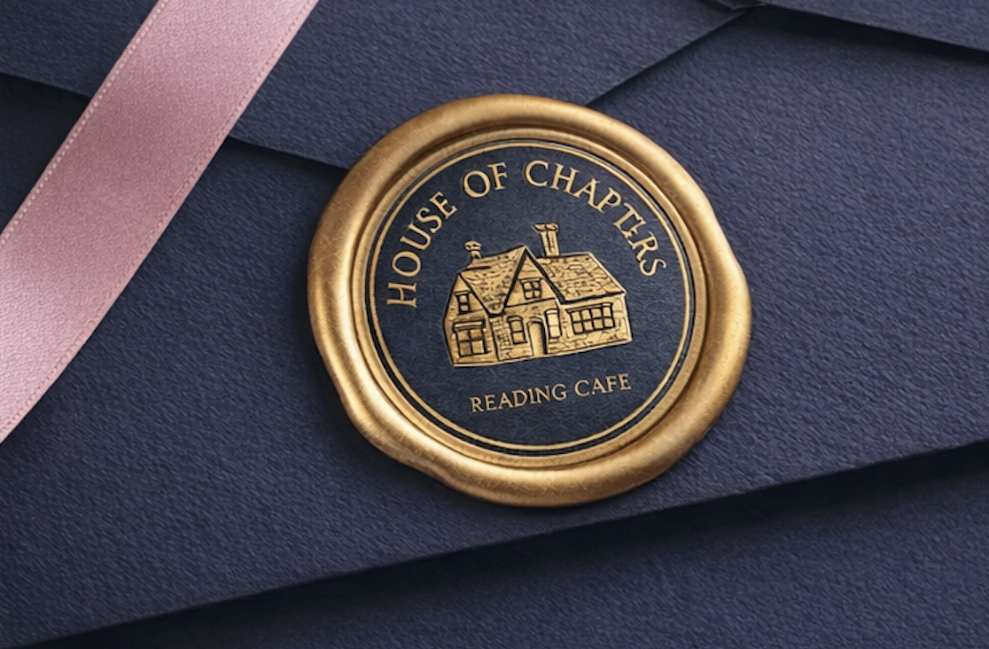
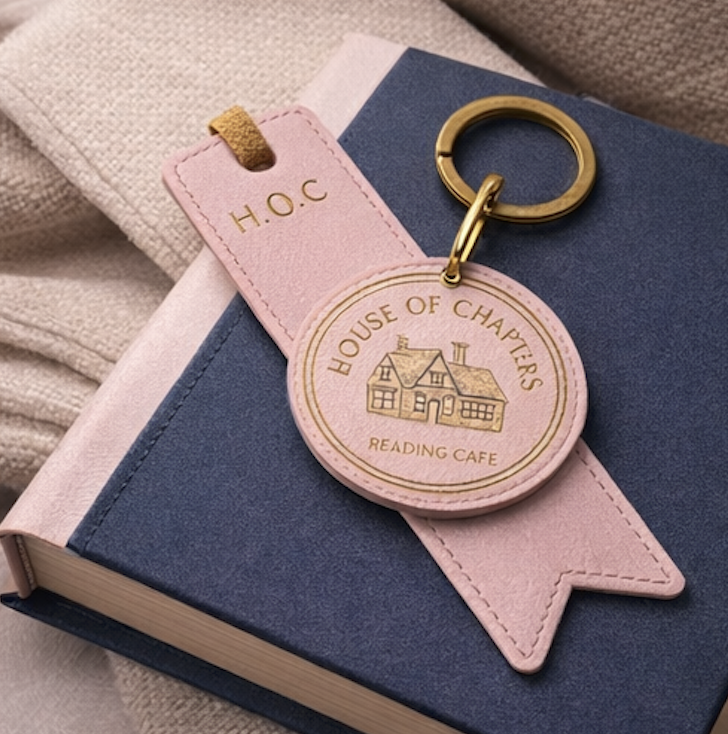
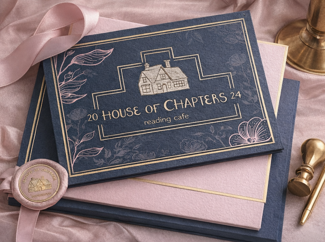
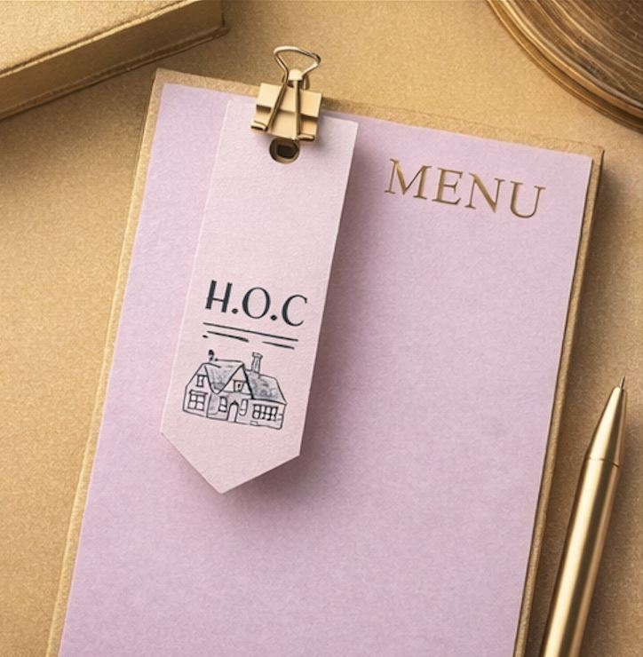
The most distinctive element of the House of Chapters identity is the custom typeface. Rather than reaching for an off-the-shelf serif, the logotype uses an original design — giving the brand a typographic voice that is entirely its own. The decorative bracket framing around the house illustration reinforces the literary, bookplate aesthetic, while the wax seal mark extends the identity into a secondary lockup suited to tactile print applications.
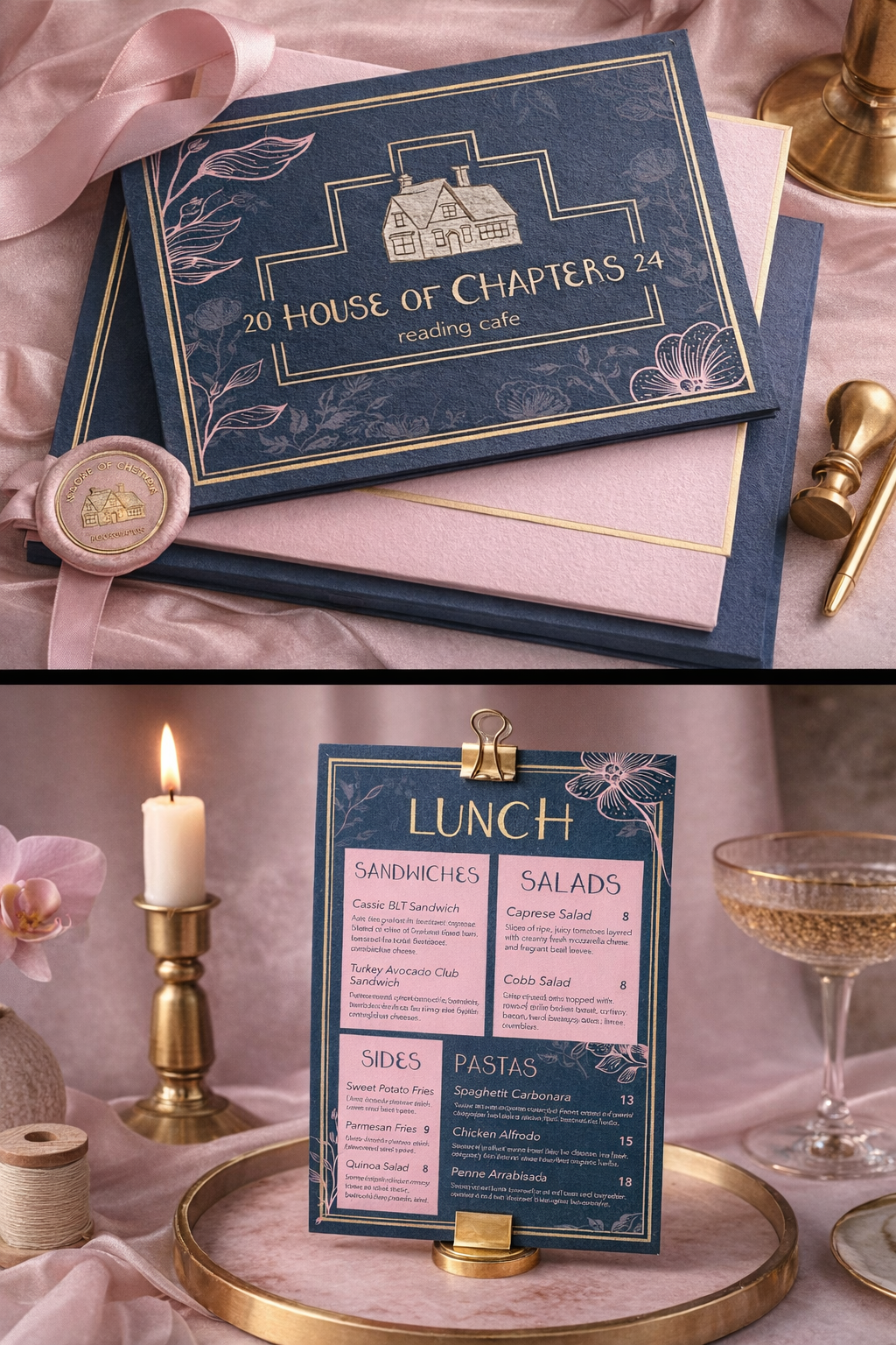
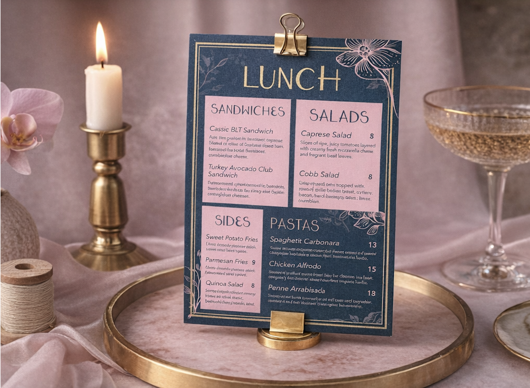
The print suite covers every surface a customer encounters in the space — from the menu in their hands to the stationery clipped to the table. Each piece carries the navy and gold palette consistently, with the botanical illustration pattern extending the brand into texture and surface detail. The floral motif references pressed botanical prints, reinforcing the literary, antiquarian aesthetic without feeling period-costume.
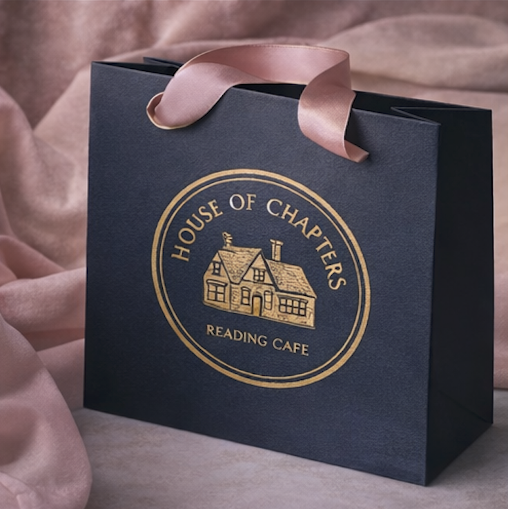
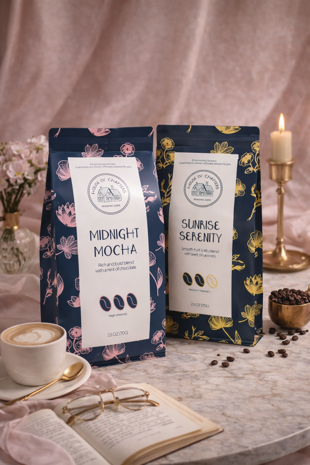
The packaging system extends the brand into retail and gifting — designed to be kept rather than thrown away. The gift bag carries the circular seal mark in gold foil on navy, with blush ribbon handles. The branded coffee blend packaging uses the botanical pattern in two colourways — pink and gold — differentiating the product range while staying within the brand system. Both are designed to sit on a shelf and be coveted.
House of Chapters demonstrates the depth of brand thinking Studio Kaiso applies to hospitality and lifestyle briefs — from a custom typeface that no other brand owns, to packaging designed to be kept. Every element connects back to the same brand world.
About this project — House of Chapters is a self-initiated concept project developed to explore luxury hospitality brand identity, custom type design, and print and packaging design. Mockups were produced using AI visualisation tools. It demonstrates the full range of identity and print capability Studio Kaiso applies to lifestyle and hospitality clients.