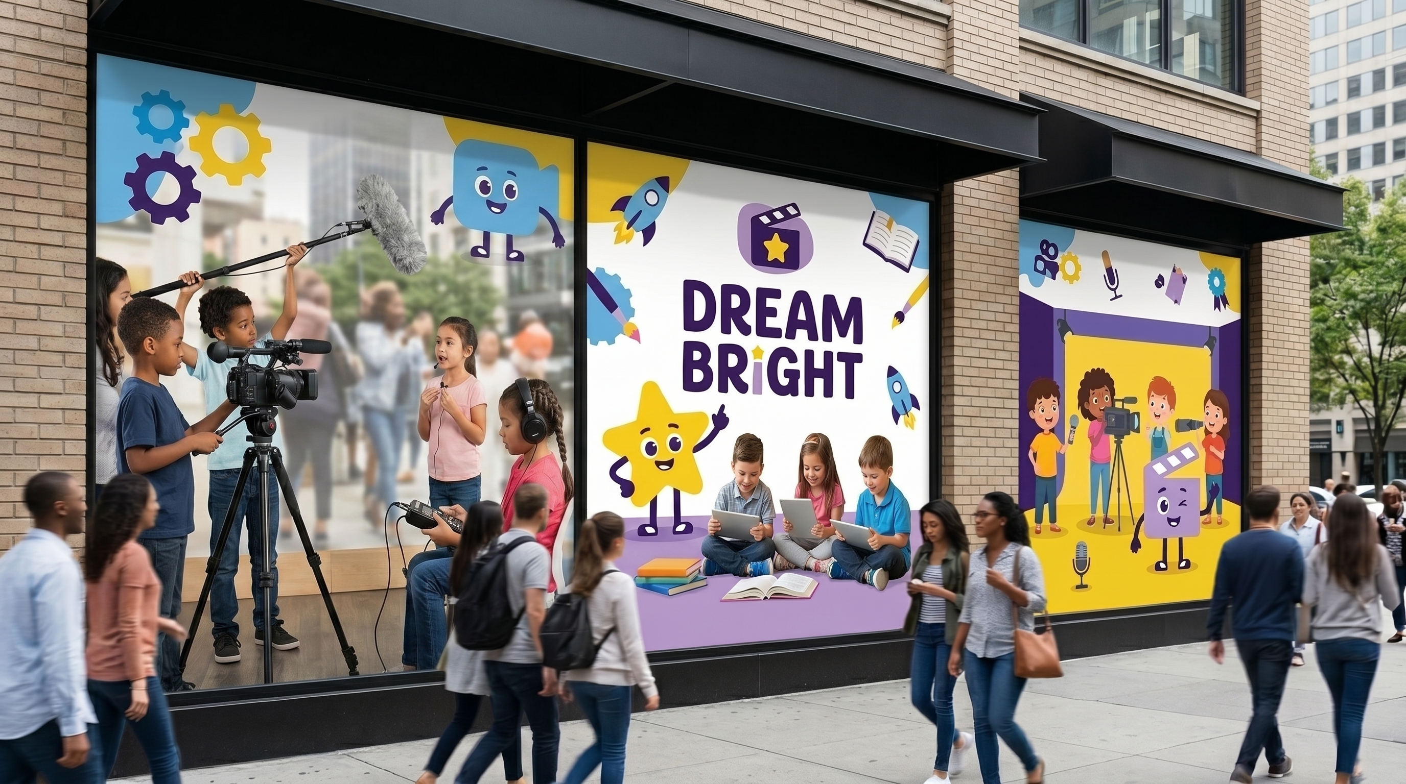
 Venue window graphics
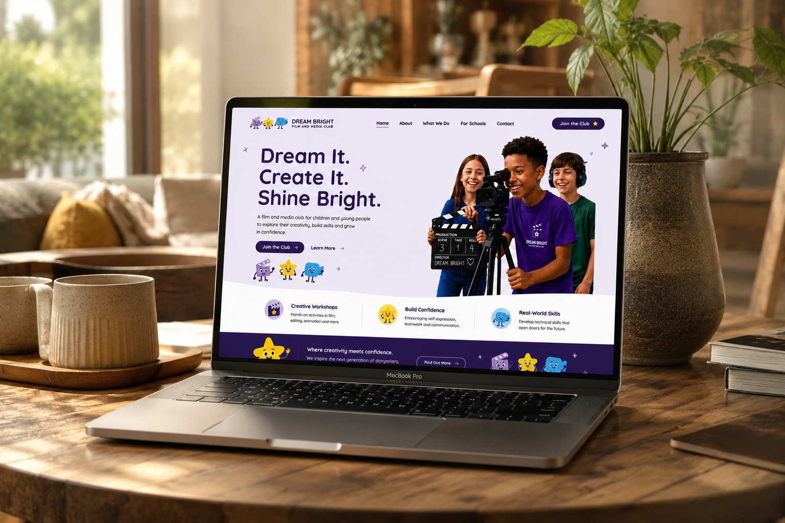
A youth charity doing excellent work with a brand that wasn't communicating it. A complete visual identity built around bold characters, a confident palette, and a system designed to travel from posters to merchandise to venue walls.
Venue window graphics
Youth organisations often look like after-school clubs. Dream Bright needed to feel like a destination: somewhere young people would want to belong to, not just attend.
The brief was to build an identity that could hold its own on a bus-shelter poster or a phone screen, while staying immediately warm and accessible. The answer was characters: three mascots that give the brand a world to live in, instantly memorable and infinitely flexible.
Deep purples anchor the brand with ambition and creativity. Sky blue and star yellow bring energy and warmth without tipping into chaos. A palette that stands out in a category that defaults to primary colours and clip-art.
Each character is built on the same visual grammar: bold rounded shapes, expressive faces, consistent proportions so they read as a family whether they appear together or alone. No stock illustration, no templates: designed from scratch to feel like they belong to this brand and no other.
 Clapper
The host
Clapper
The host
 Star
The performer
Star
The performer
 Camera
The creator
Camera
The creator
The primary identity combines the illustrated clapperboard icon with bold stacked typography and the "Film. Create. Believe." tagline. Built to work at any size: from a phone screen to a billboard, from an embroidered tee to a bus shelter.
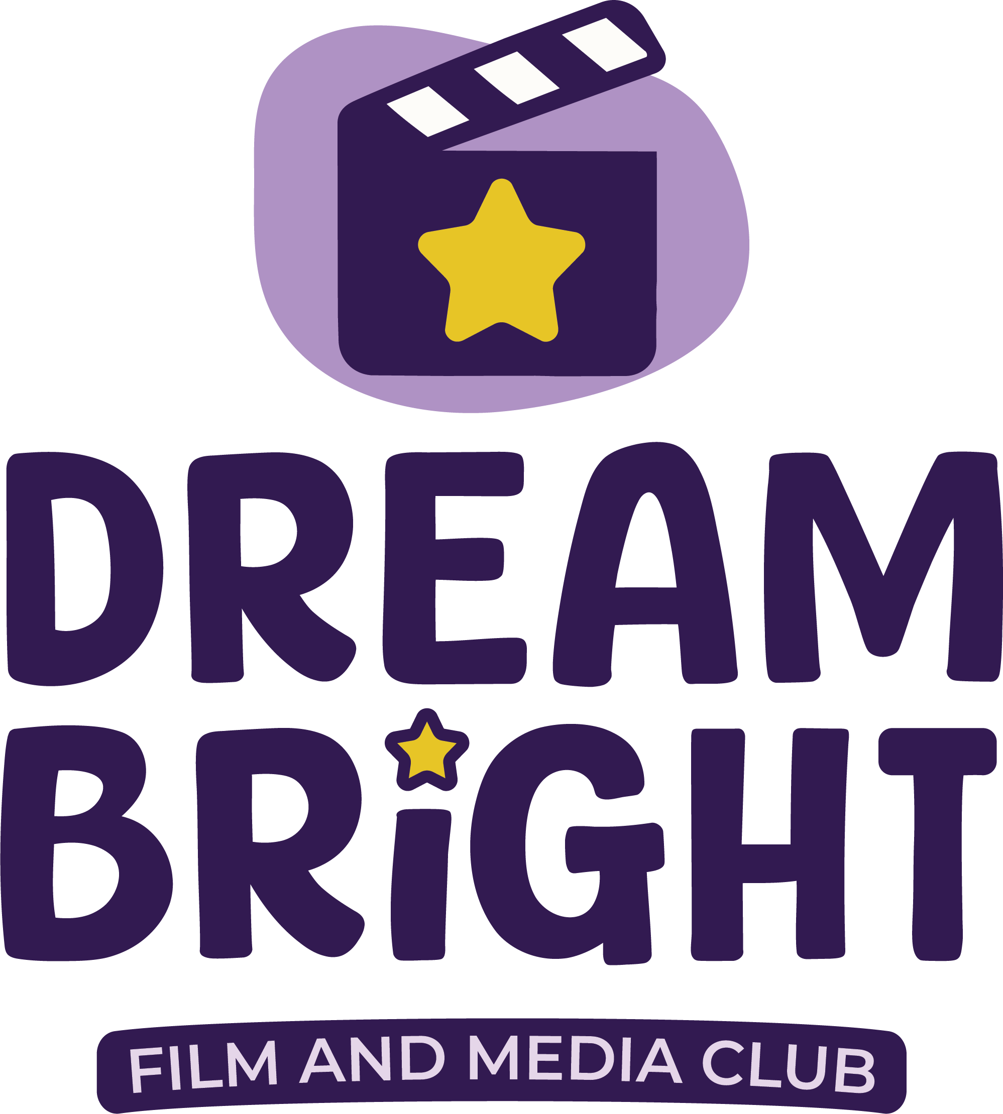 Primary identity
Where an identity proves itself: across the screens young people browse, the ads they walk past, the tees they wear to sessions, and the merch they carry home.
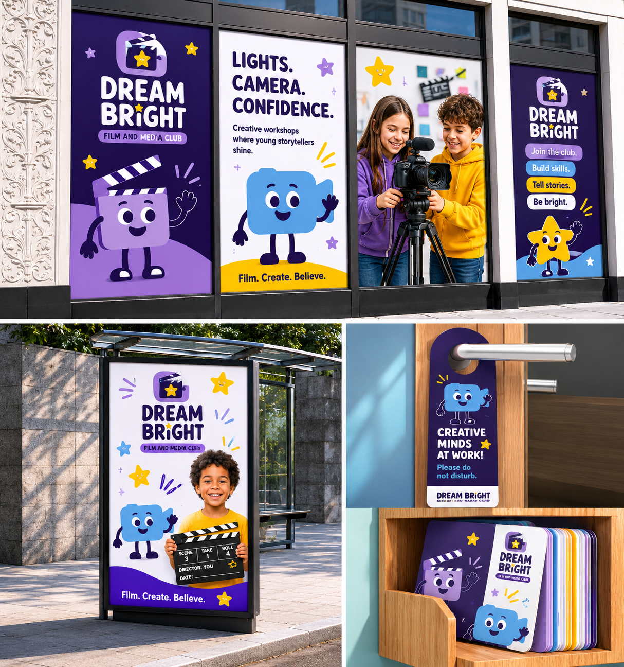

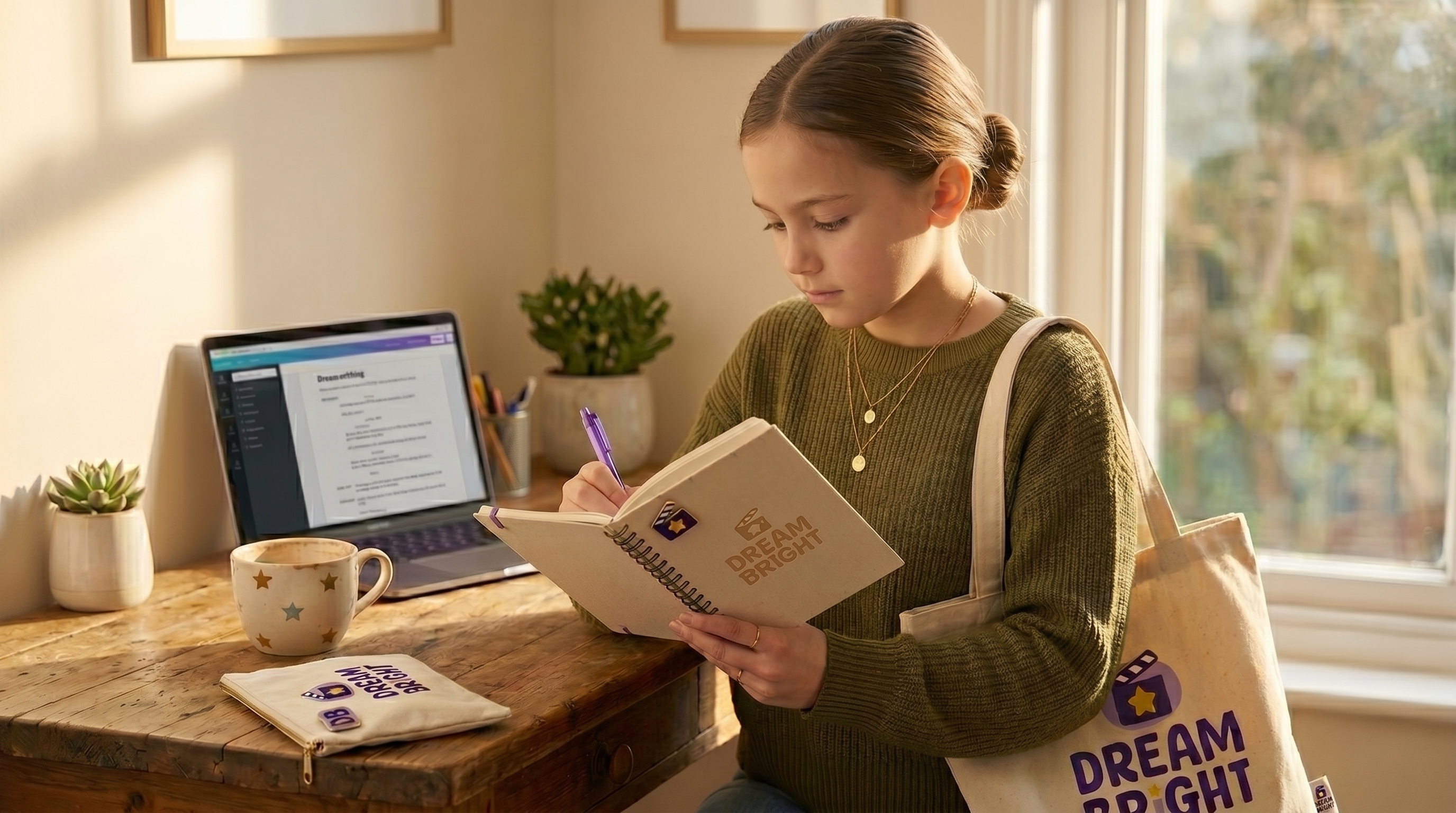
Dream Bright shows how a character-led identity system can scale from a small charity to a full brand world: present on the street, on the screen, and on the backs of the young people it serves.